


Our Identity
Our brand balances professionalism with approachability. We build software that handles complexity so our customers don't have to - and our visual identity reflects that: clean, confident, and straightforward.
- Simple over clever. Our brand should feel effortless to use, just like our product.
- Confident, not loud. We let the work speak. No gratuitous gradients or busy patterns.
- Consistent everywhere. A slide deck, a tweet, and a help article should all feel like they come from the same company.
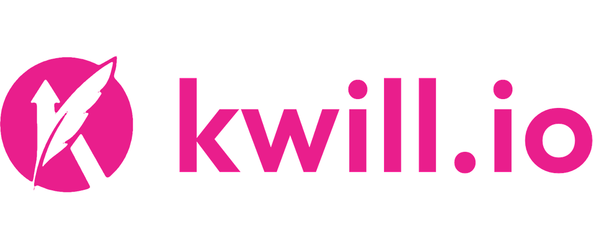
Logo Usage
Lockup is the default logo for most uses - website headers, pitch decks, email signatures, printed materials, and event signage. It includes the wordmark and should never be cropped, rearranged, or recreated.
Icon is for compact spaces - app icons, favicons, social profile pictures, and small-format swag. Always pair it with the company name nearby when the audience may not recognize the icon alone.
Use the color versions on white or light backgrounds. Switch to the white versions when placing on dark backgrounds, photographs, or colored surfaces. Never place the color logo on a busy or low-contrast background.
Clear space: Keep a minimum buffer equal to the icon height on all sides. Don't crowd the logo with other elements.
Don'ts: Don't stretch, rotate, recolor, add drop shadows, or apply effects. Always use the provided files.
Color Guidelines
Primary is the backbone of the brand. Use it for buttons, links, key headlines, and interactive elements. It should be the dominant brand color on any page.
Secondary adds depth and contrast. Use it for dark sections, footer backgrounds, code blocks, and secondary UI surfaces where you need a strong alternative to white.
Accent is the attention-grabber - use it for CTAs, badges, status indicators, and anything that needs to pop. A little goes a long way; don't let it compete with Primary.
Neutral handles everything else: body text, borders, subtle backgrounds, and dividers. Prefer lighter values (50–200) for backgrounds and darker values (700–900) for text. Avoid pure black - use Neutral 900 instead.
Keep the palette restrained. A page should feel polished and focused, not carnival.
Typography
Use the display font for all headings, page titles, hero text, and marketing headlines. Use the body font for paragraphs, UI text, documentation, and everything else.
Maintain clear hierarchy: one heading level per section, consistent sizing, and generous line height. Avoid all-caps except for short labels, badges, or eyebrow text.
General Guidance
- Consistency builds trust. Every touchpoint - landing page, onboarding email, support doc - should feel like the same company.
- Accessibility is non-negotiable. Maintain WCAG AA contrast ratios. Use alt text on all images. Choose legible sizes.
- White space is intentional. Give content room to breathe. Dense layouts feel cheap; spacious ones feel premium.
- When in doubt, keep it simple. One font, one primary color, plenty of breathing room. Less is almost always more.